26 June 2023 Elena Toniolo
Journal of Experiences
Strategies for reducing the paradox of choice: deconstructing, personalizing and designing the scent of information to improve the user experience

The paradox of choice means that state of great difficulty that we find ourselves experiencing when, in making a given decision, we have many options.
Just think of the moment in which we enter a wine shop and instead of deciding whether to buy a white or red wine we are faced with infinite variables such as, for example, the grape variety, the vintage or the geographical area.
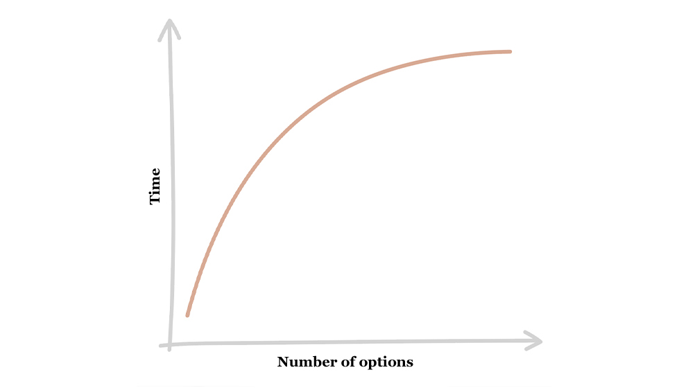
It is scientifically proven that as more choice options increase, the time it will take us to take one will be much higher.
This theory is described in what is known as Hick’s law:
“The time needed to make a decision varies according to the number of options available”.
But are we really sure?
Based on this law, therefore, we should reduce the number of options to improve people’s experience in interacting with a menu, a catalog, etc.
In the past, those involved in information architecture and UX in general adopted an approach according to which fewer clicks within an interface determined a higher quality of interaction.
Over time, however, this aspect has radically changed and today we know that both the paradox of choice and an information overload are more a problem of quality (that is, how information is presented to people) than a problem of quantity ( i.e. the number of options available).
That’s why designers today know that wide and shallow structures are preferable to narrow and deep structures, only and exclusively, however, if consistency is respected.
Strategies for reducing the paradox of choice
Those involved in organizing content therefore know that they must apply some strategies in order to reduce the paradox of choice, such as: breaking down, personalizing and designing the scent of information.
Decompose
To reduce this cognitive “l” and consequent sense of frustration, what we can do when we are designing information architectures is to decompose the contents and create macro-categories that allow us to reduce the components of certain categories.
One of the activities that we carry out in TSW to compose certain contents is card sorting because it involves the involvement of the people who will interact with that information space and consequently, for us, it is the best possible approach.
An emblematic example of breaking down can be found in the filters of car sites, where, by entering the type of power supply or the brand of the car, we help people to reduce the search results.
Customize
Being able to personalize the contents to be presented as soon as a person accesses our digital space, as well as being highly engaging, helps to reduce the paradox of choice. Product personalization refers, for example, to the “Continue shopping” and “Products suggested for you” sections.
We find this approach in many applications that we use every day, from Amazon to Subito, to online shopping apps, etc.

Designing the “information scent”
The “perfume of information” provides us with a preview, while we are carrying out a search, of the possible categories of belonging of a particular product.
This helps us to contextualize the searched product.
An example can be found on the Vinted APP which I report below.

Conclusions
In addition to these three important elements, designers know that in the design phase they must pay attention to many other aspects to lower the cognitive effort of users.
For us at TSW, the first is always to involve people in order to be able to understand their precious point of view, their thought pattern and their important expectations every day.
Having collected this information, we can organize it by paying attention to:
- responding immediately to people’s primary needs;
- create a clear hierarchy of content by prioritizing relevant information;
- enter the right number of calls to action to guide clearly and simply.
For those interested in learning more about this topic, I recommend reading the book by Barry Schwartz “The paradox of choice: why more is less“. Here you can also listen to his speech at TED Global 2005, always absolutely topical.