Anyone who works in digital knows that website design is never a linear process. It is in itself an artisanal and delicate work, orchestrating complex skills and needs and managing tasks that at times seem to be antitheses. What is it exactly that this business is asking for? What is required to for this project to be correctly marketed? Is it possible to create a visually pleasing, yet functional interface? And, which type of content is being favored by search engines?
Now, let’s think of building a website like building a house. The plumber must know where the kitchen will be before designing the plumbing system. To choose the best solution for illuminating the living room, the interior designer must know the structural limits of how the electrical grid can be installed. In the end, however, it is those who will live in the house that decree the success of its design, regardless of the sophisticated plumbing system and admirable recessed lighting. Is it a nice house to live in?
The same goes for a website. The satisfaction of the user for whom the site is designed is, and should always be, a common goal for all the heads at the table. Furthermore, to make sure we are not mistaken, it is precisely at this table where users should be invited to sit, alongside the company and the designers in a common effort to generate value for the brand and for people.
With this in mind, the new Cipriani Drinks website is an exuberant example of how users can contribute to the construction of a digital experience without stealing the shine from the brand and all its business and communication needs. An enlarged table with a beautiful story to tell and many hands writing their small part of it.

Web design in short: what it is, what it is used for, and how to do it well.
First of all, web design is design, and design is not just aesthetic. It is not a list of features, nor articulated lines of code, nor yet a collection of verbose and self-referential content. Web design, when done well, means giving shape to a space of interaction between users and the brand. A place where the former share their time, their needs, and their curiosities, and where the company has the opportunity to help them find what they are looking for.
The “user-centric” formula has been repeated like a mantra in this industry for years. It is written everywhere, found in every motivational speech, and carried around like a crumpled up and out-of-date business card in the hands of digital players.
When web design is done well, however, there is no user at the center. The user is sitting at that table with us, where we make decisions together. They are on the other end of the phone when we have a doubt on how to proceed, they are in front of us when we have the humility to question ourselves and verify if the experience that we have designed for them is what they are looking for.
Cipriani Drinks and web design that welcomes.
Cipriani Drinks is the exclusive supplier of alcoholic products from the Cipriani brand, a group known all over the world for its luxurious restaurants and hotels, from New York to Dubai. If you are already familiar with the Cipriani name, you know that one of the most fascinating stories in this sector was born right in the middle of these two great metropolises. It was at the beginning of the last century when, in a former rope warehouse near Piazza San Marco in Venice, Harry’s Bar came to life.
It is the story of a family and three generations of passionate hospitality intertwined with the world of art and literature, with characters of the caliber of Ernest Hemingway and Orson Welles, and Queen Elizabeth and Naomi Campbell. But that story is not for me to tell.
Something we really liked, from the first moment we sat at the table with the Cipriani Drinks team, was the extraordinary alignment between the raison d’être that pervades the story of this brand and the ultimate goal that TSW ascribes to design. A tribute to hospitality, to the need of having a pleasant and satisfying experience, whether it be in a legendary restaurant in Calle Vallaresso, at home with a good bottle of Bellini, or on a website.
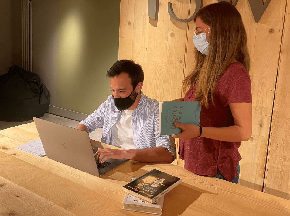
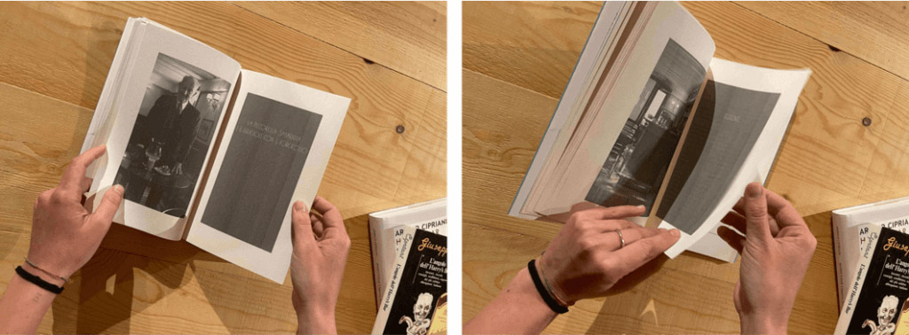
We believed in Cipriani Drinks, and Cipriani Drinks believed in us. We visited Harry’s Bar several times, tasted the products, read the books written by family members; we plunged ourselves into this fascinating and invaluable universe to better understand how to pass it on to the people who would land on the website we were about to design. And so, we took them with us.

The new Cipriani Drinks website.
ciprianidrinks.com has managed to effectively combine the communication needs of the brand (and there were many, with such a unique historical background which at times seemed almost cumbersome), its business objectives to position branded alcoholic products on the consumer market, and the needs of people. Needs that sometimes translated into a slightly larger font, and other times into a page dedicated to illustrating how to best combine a Bellini with appetizers to make a good impression on your houseguests during an aperitif in the garden.
This is simply how website design is done. In jargon it is called a usability test, but it is nothing more than a moment of reconnection between the company, its potential customers, and designers. We sat together in a room, guided users through the exploration of the newly designed website and listened to their impressions, trying to understand where the experience was effective and where it could be modified.
It is precisely in these moments that it becomes evident how the time we spend planning, making decisions, drawing, and developing with our heads down on our hand on our keyboards loses meaning entirely if we are not looking at the real reason why we are doing what we are doing. And this ‘why’ is neither user-centric, nor responsive, nor seo-friendly. It is a girl in her thirties with a beautiful house and a stylish haircut, who welcomes her friends to the table with an original aperitif that she found online.
“TSW knew how to interpret what I was looking for. It wasn’t an easy goal to reach, we wanted to design a website that felt like home for Cipriani Drinks, something that allowed users to live a unique experience just like when they enter Harry’s Bar. And we did it! The website is an integral part of our digital project.”
– Tommaso Casara, CMO Cipriani Drinks